Climate data stories
Climate data visualisation
Research, data acquisition and analysis, and visualisation, with the writing around it. Each project has its own page with how it was made.
Independent work, 2026
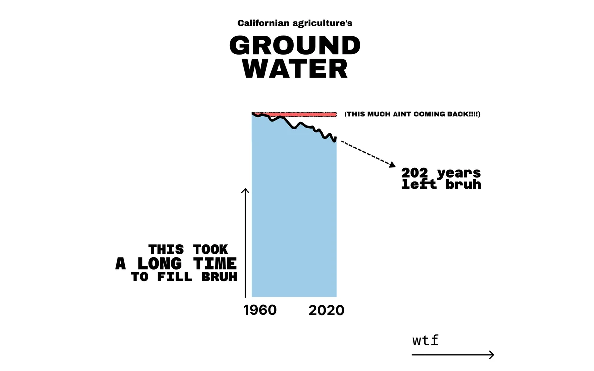
Earth.Org, 2020 to 2022
I was Data Journalism Team Lead at Earth.Org from January 2020 to January 2022, leading a volunteer data team of between 5 and 15 people. For each piece I conceptualised it, did the research and directed the number crunching and the final design; a graphic designer handled final production. The site's monthly clicks grew from about 10,000 to about 680,000 (68x) during my time there. That is the whole site's growth, which I contributed to. The work has been cited by JSTOR, UPenn, Verisk, US law reviews and university research, without outreach or link-building (see citations). Technical stack: Python for data analysis, QGIS for geospatial visualisation, Adobe Illustrator for final production.
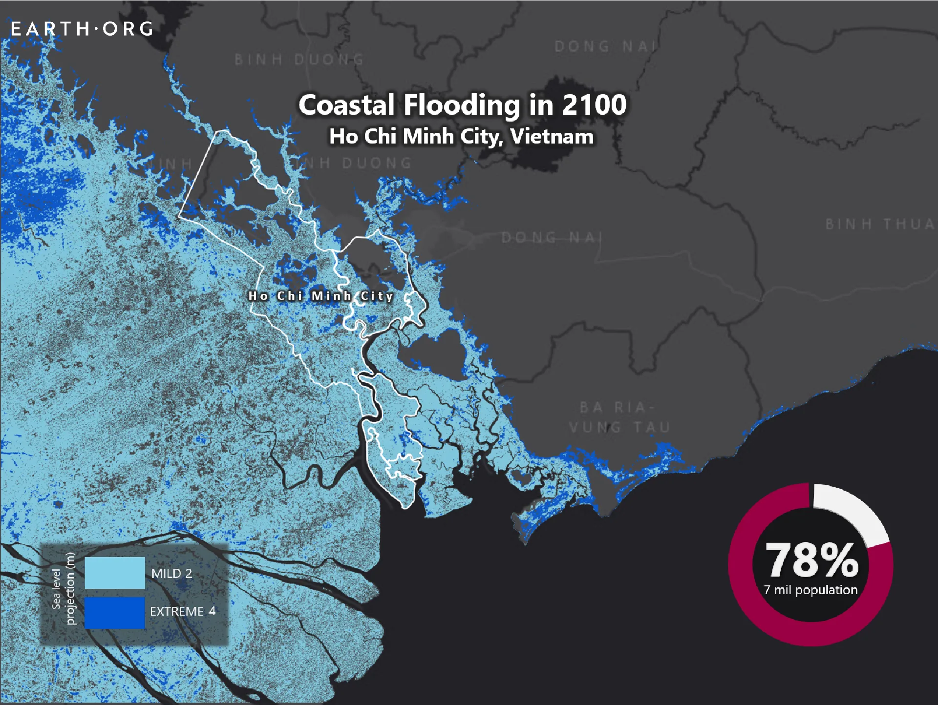
Earth.Org, 2020 to 2022
Sea Level Rise 2100
A 72-piece series mapping sea level rise to 2100, city by city, produced in about six weeks in 2020. Built from Climate Central's coastal risk tool and peer-reviewed projections (Kopp et al., Kulp and Strauss, Muis). Its work has been cited in US law reviews and university research.
Python · QGIS · Illustrator
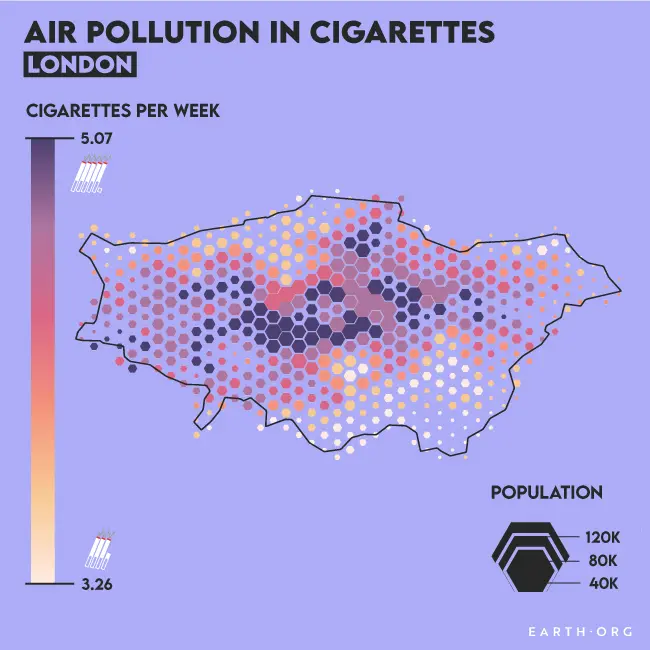
Earth.Org, 2020 to 2022
Air Pollution in London
London's air pollution (PM2.5) translated into cigarettes smoked per week and mapped across the city.
Python · QGIS · Adobe Illustrator
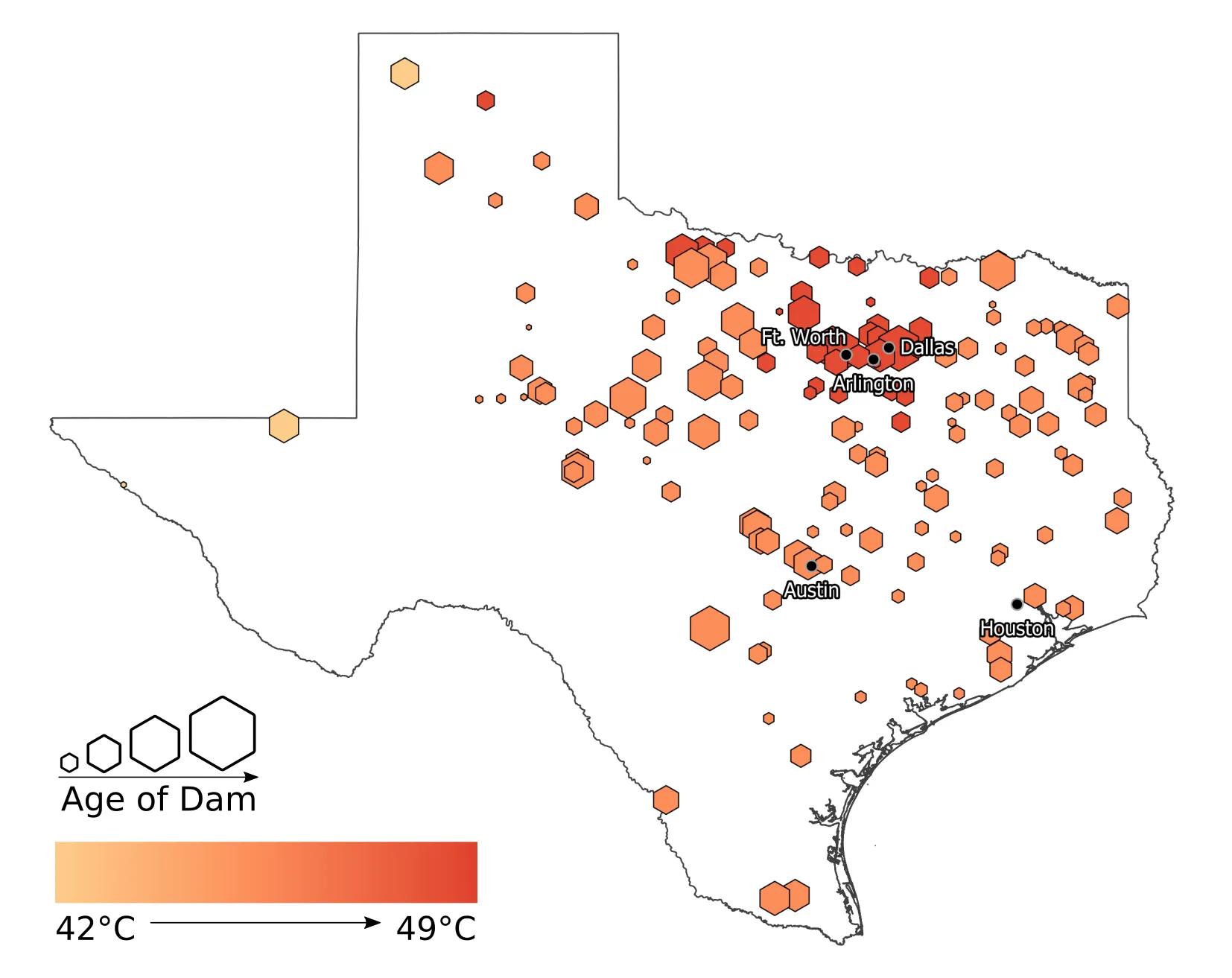
Earth.Org, 2020 to 2022
Hotspots: US Dams Under Pressure
The US has around 91,000 dams, many of them old.
Python · QGIS · Adobe Illustrator
Earth.Org, 2020 to 2022
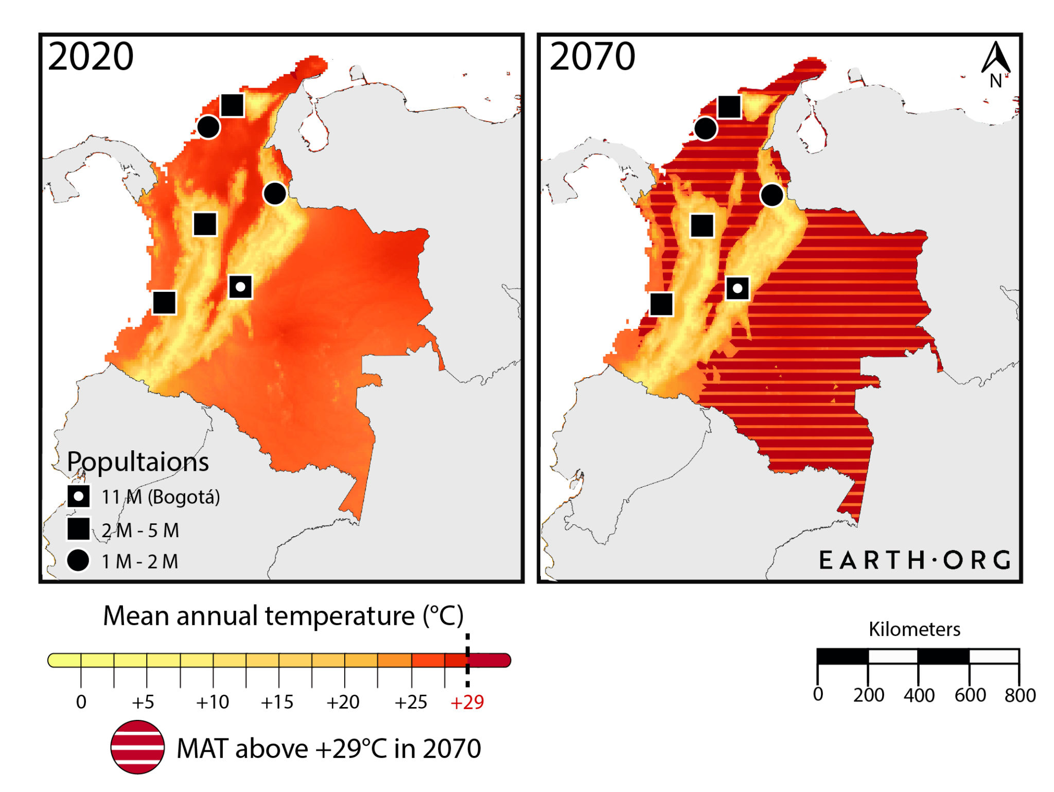
Too Hot To Live
A series asking where mean annual temperatures could pass the 29°C level that people have historically avoided living above.
Python · R · Adobe Illustrator
Earth.Org, 2020 to 2022
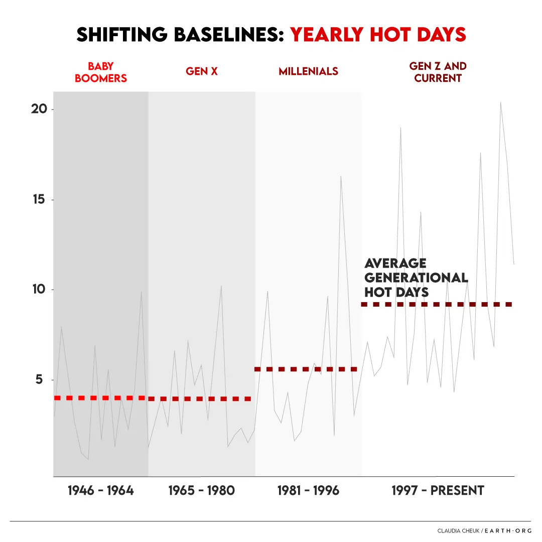
Shifting Baselines and the Elusiveness of Climate Change
Why does gradual climate change go unnoticed? The piece compares what each generation in Germany has experienced as normal: hot days per year rose from about 4 for Baby Boomers to about 9 for Gen Z, and frost days fell by about 16 over the period.
Python · Adobe Illustrator
Earth.Org, 2020 to 2022
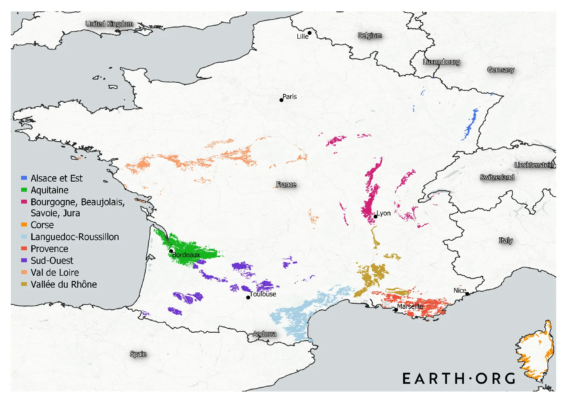
Extreme Temperatures, Part II: France
What could the most extreme summer heat mean for French agriculture? Of 3,518 geocoded dairy farms, 28% sit in zones that could pass 38°C under 2°C of warming, rising to 78% under 4°C.
Python · QGIS · Adobe Illustrator
Earth.Org, 2020 to 2022
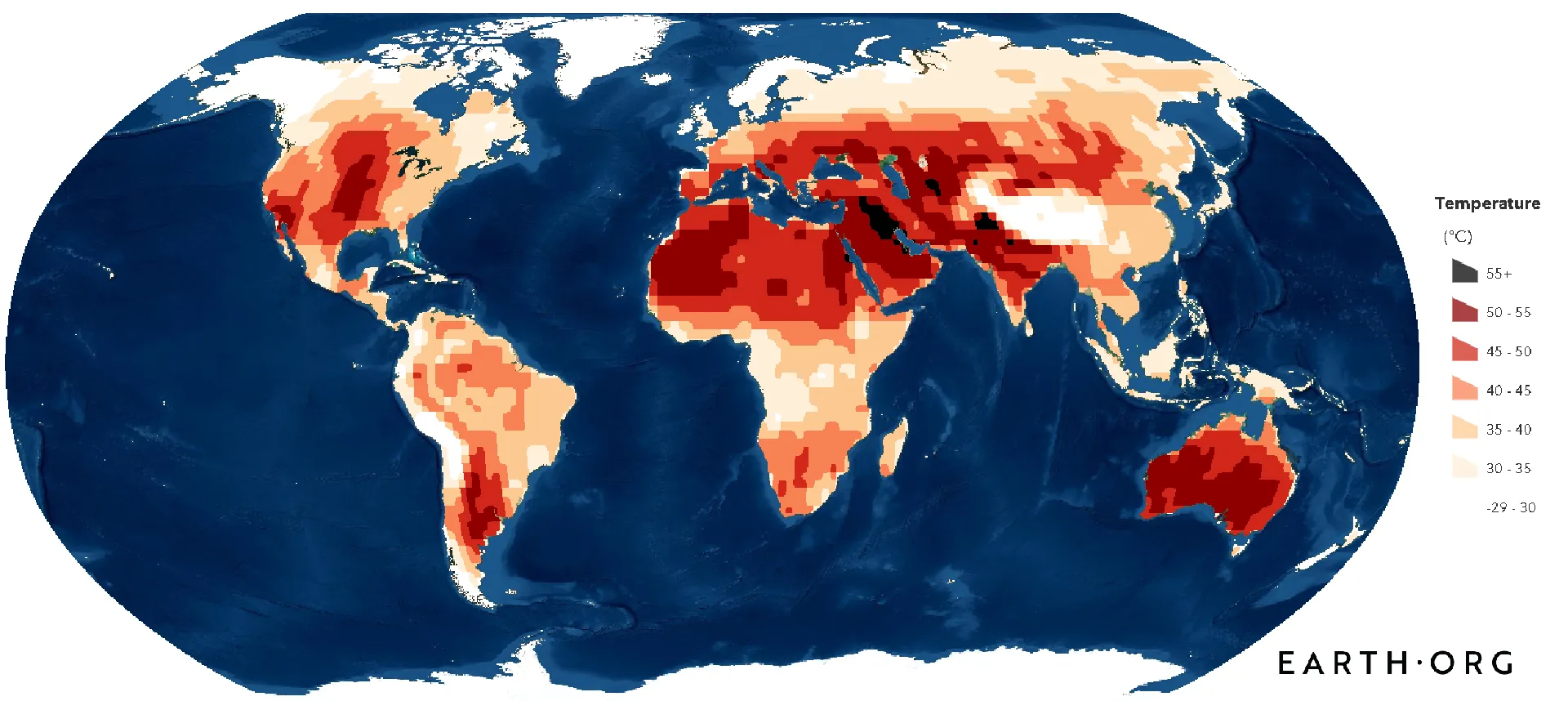
Extreme Temperatures, Part III: Canada
Canola accounts for about a quarter of Canadian crop sales, and its fields sit mostly in the prairie provinces.
Python · QGIS · Adobe Illustrator